Block-based editing
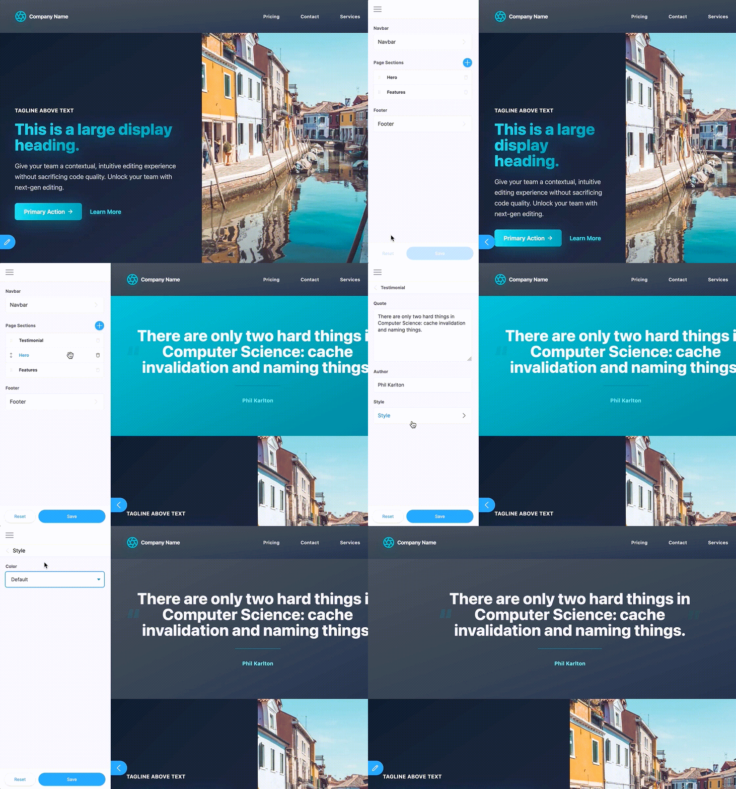
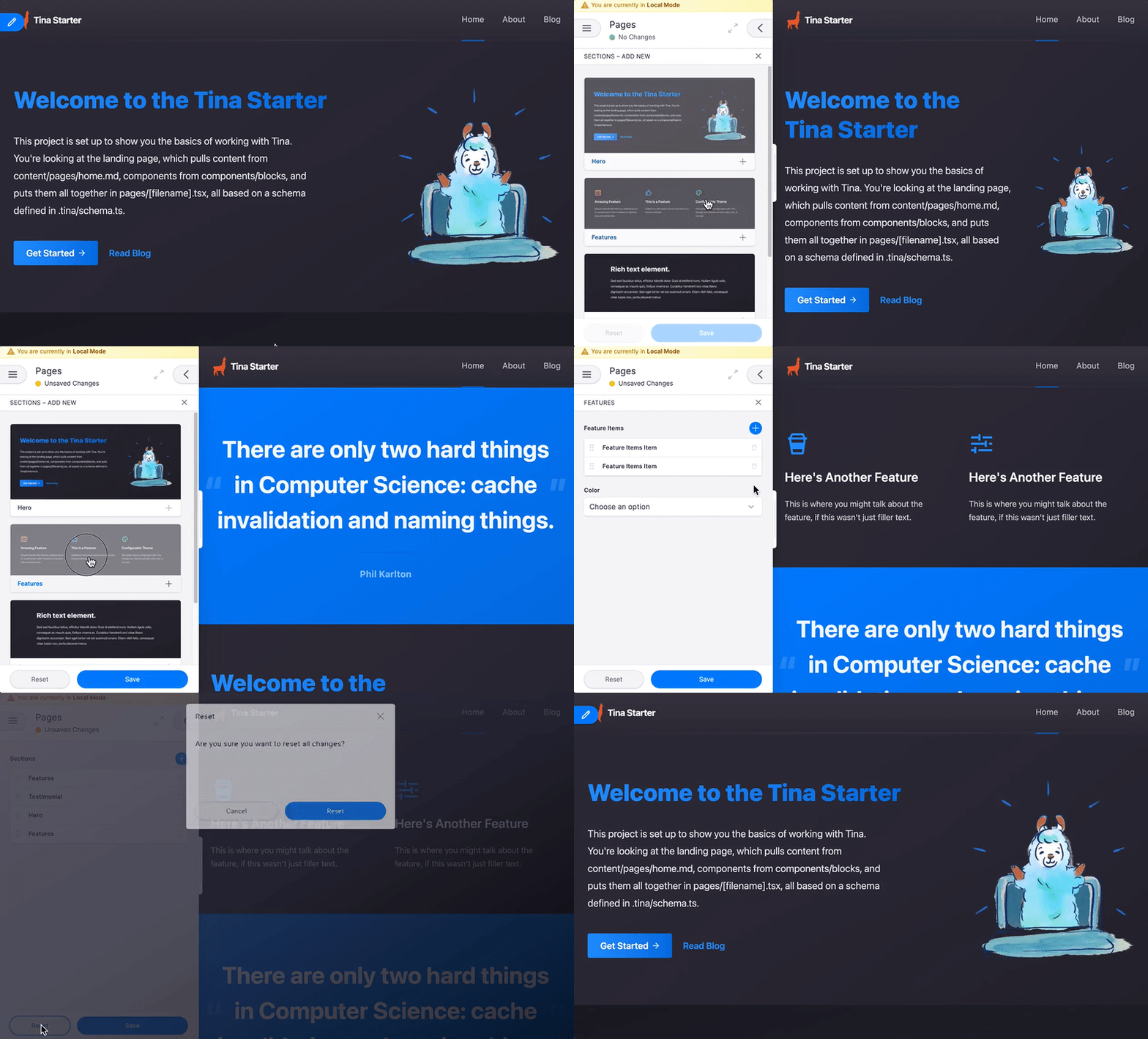
Tina supports block-based editing, so that your editors can build out full pages using your pre-defined blocks.

Let's say you want your editors to build out a page, and you have 3 main "block" types to start:
- a "Hero" block
- a "Feature" block
- a "Main Content" block
We want to allow our editors to use various blocks on each page.
Defining our schema
We are going to use the object type, and provide a list of templates, where each "template" represents a unique block type.
import { defineConfig } from 'tinacms'import type { TinaTemplate } from 'tinacms'const heroBlock: TinaTemplate = {name: 'hero',label: 'Hero',ui: {defaultItem: {tagline: "Here's some text above the other text",headline: 'This Big Text is Totally Awesome',text: 'Phasellus scelerisque, libero eu finibus rutrum, risus risus accumsan libero, nec molestie urna dui a leo.',},},fields: [{type: 'string',label: 'Tagline',name: 'tagline',},{type: 'string',label: 'Headline',name: 'headline',},{type: 'string',label: 'Text',name: 'text',ui: {component: 'textarea',},},],}const featureBlock: TinaTemplate = {name: 'features',label: 'Features',fields: [{type: 'object',label: 'Feature Items',name: 'items',list: true,fields: [{type: 'string',label: 'Title',name: 'title',},{type: 'string',label: 'Text',name: 'text',},],},],}const contentBlock: TinaTemplate = {name: 'content',label: 'Content',ui: {defaultItem: {body: 'Lorem ipsum dolor sit amet, consectetuer adipiscing elit. Donec odio. Quisque volutpat mattis eros. Nullam malesuada erat ut turpis. Suspendisse urna nibh, viverra non, semper suscipit, posuere a, pede.',},},fields: [{type: 'string',ui: {component: 'textarea',},label: 'Body',name: 'body',},],}export default defineConfig({// ...schema: {collections: [{// ...fields: [{type: 'object',list: true,name: 'blocks',label: 'Sections',templates: [heroBlock, featureBlock, contentBlock],},],},],},})
We have defined the structure of our 3 blocks (content, features, hero), as well as our main blocks field: blocks.
Note, since our contentBlock uses the markdown plugin which is not registered out of the box, we will need to manually import the react-tinacms-editor plugin.Querying Block Data
Because each item in a list of blocks can have a unique schema, querying this data isn't as straightforward as other types of fields. We'll need use GraphQL's fragment syntax to query the appropriate data shape for each block type.
The fragment names are automatically generated based on the collection name and parent field name. For example, if the collection is pages, the field is blocks, and the block's name is hero, the fragment will be named PagesBlocksHero.
{pages(relativePath: "turbo.json") {blocks {__typename... on PagesBlocksHero {__typenametaglineheadlinetext}... on PagesBlocksFeatures {__typenameitems {titletext}}... on PagesBlocksContent {__typenamebody}}}
{"data": {"pages": {"blocks": [{"__typename": "PagesBlocksHero","tagline": "Turbo means good","headline": "The All-New Turbo Model","text": "Think fast. Think Turbo."},{"__typename": "PagesBlocksFeatures","items": [{"title": "10% Faster","text": "Than our slow one"},{"title": "Safer Than Ever","text": "We settled the lawsuits out of court"}]},{"__typename": "PagesBlocksHero","tagline": null,"headline": "Our Story","text": "Read about the history of Turbo"},{"__typename": "PagesBlocksContent","body": "Lorem ipsum dolor sit amet"}]}}}
For more info on how to query data with Tina's GraphQL API, check out the Query Documentation
Rendering our blocks
We can render out the blocks on a page by creating a new Blocks component, which will conditionally render each block-type in a switch statement.
// Blocks.tsximport React from 'react'import type { Pages } from '../tina/__generated__/types'import { Content } from './blocks/content'import { Features } from './blocks/features'import { Hero } from './blocks/hero'import { Testimonial } from './blocks/testimonial'export const Blocks = (props: Pages) => {return (<>{props.blocks? props.blocks.map(function (block, i) {switch (block.__typename) {case 'PagesBlocksContent':return (<React.Fragment key={i + block.__typename}><Content data={block} /></React.Fragment>)case 'PagesBlocksHero':return (<React.Fragment key={i + block.__typename}><Hero data={block} /></React.Fragment>)case 'PagesBlocksFeatures':return (<React.Fragment key={i + block.__typename}><Features data={block} /></React.Fragment>)default:return null}}): null}</>)}
Note that the __typename on each blog is {CollectionName}{FieldName}{BlockTemplateName}.
In our case:
- CollectionName: "Pages"
- FieldName: "Blocks"
- BlockTemplateName: "Content" | "Hero" | "Features"
Adding a visual block selector (Experimental)

This is an experimental feature, and the API is subject to change. Have any thoughts? Let us know in the chat, or through one of our community channels
This visual block selector allows editors to select blocks from a set images instead of text.
First, to enable the visual block selector the visualSelector property in the UI key must be set to true.
...export default defineConfig({// ...schema: {collections: [{// ...fields: [{type: 'object',list: true,name: 'blocks',label: 'Sections',+ ui: {+ visualSelector: true,+ },templates: [heroBlock, featureBlock, contentBlock],},],},]}})...
To set up the block selector a preview image must be provided for each block you want a preview image for. The basic structure for each block looks like this.
const featureBlock = {name: 'features',label: 'Features',+ ui: {+ previewSrc: "https://...",+ },fields: [{type: 'object',label: 'Feature Items',name: 'items',list: true,fields: [{type: 'string',label: 'Title',name: 'title',},{type: 'string',label: 'Text',name: 'text',},],},],}
The previewSrc is an image URL that will be rendered in the visual selector. If a preview isn't provided the block will still be available with a title to click on, just no preview image will be displayed.
optionally a category can be provided that allow the blocks to be grouped into different categories.
const featureBlock = {name: 'features',label: 'Features',ui: {+ category: "Page Section",previewSrc: "https://...",},fields: [{type: 'object',label: 'Feature Items',name: 'items',list: true,fields: [{type: 'string',label: 'Title',name: 'title',},{type: 'string',label: 'Text',name: 'text',},],},],}
Video Tutorial
For those who prefer to learn from video, you can check out a snippet on "Setting Up Blocks" from our "TinaCMS Deep Dive" series.
Last Edited: September 18, 2024
Comparisons
© TinaCMS 2019–2024